Erin Condren Life Planner Layout Comparison
This post may contain affiliate links. See our full disclosure policy, here.
Okay planner friends, I’m so excited for this post because it has been a long time coming. I shared with you my vertical Erin Condren Life Planner that was sent to me as part of a PR package, but I also saved up all of my referral credits this last year so that I would be able to get each planner style and the two color styles to share for you to compare and choose a layout and color style if you are shopping for one of the new Life Planners this year. I also filmed a flip through video to share the Erin Condren Life Planner layout and color style options.
This post contains affiliate links. See our full disclosure policy, here.

You can see my video flip through below-

The Life Planner has three layout options- vertical, horizontal, and hourly. Then, you can get each layout in either the colorful or neutral color schemes. First we’re going to look at the layout differences in the colorful color style. Then, I’ve got a look at the color style differences of the neutral and colorful vertical layout planner.

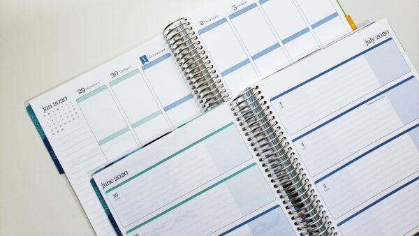
When looking at the colorful design style, the rest of the planner between the vertical, horizontal, and hourly layouts are the same, until you get to the weekly view. Here is a comparison of the vertical and horizontal weekly views. This is pretty self explanatory, one has vertical columns for each day and the other has horizontal rows for the days. The horizontal does have some separation in the design, too.

Next, here’s the vertical layout versus the hourly layout. The hourly layout also has vertical columns for the days, but is divided by the 1/2 hour from 6 am to 7 pm with an extra shaded space at the bottom.
So, those are the layout options when it comes to your weekly view, and then you can choose between the colorful and neutral color styles. Most people are pretty certain about the weekly layout they prefer, but choosing between the colorful and neutral can be harder.

You can see here the cover differences for the new layers design this year. The neutral has more muted, pastel color tones and the bright is more bold.

Once you get into the book here you can see the inside cover and the vellum sheets also have the design style you choose.

The beginning of each Life Planner starts with these quotes page. Essentially, the whole planner will have their respective design elements throughout.

The yearly overview has a little bit of each detail at the top of the page.

This yearly page that you can use for goals, annual things to remember, etc… has either a completely neutral look or the colorful accents. You can also see here the font differences between the two styles. The netural has a script font and the colorful has a more normal font.

Here you can see the difference in the monthly dividers. They both have the same quotes, but the colorful has a monochrome layers design, with each month having a different single color theme. Meanwhile the neutral has the same style on each divider.

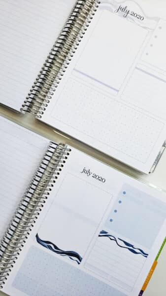
The dashboard for each month has some subtle design differences, but they’re still both customizable- you can use the sections for whatever you’d like since there aren’t predetermined headers or sections.

Here is a look at the monthly views. You can see that the monthly view in the neutral style is truly neutral. There’s not any sneaky accents this year messing with the neutrality, haha…. and as always the design for the year- layers is carried throughout the month view with the top of the page and an accent stripe at the bottom.

The weekly view is the same, this is probably the most neutral I’ve seen for a weekly view without any accents. It’s perfect if you enjoy using sticker kits in your planner and don’t want to be limited by colorful accents. The colorful has colorful headers and a shaded colorful spot at the bottom of each day. Each month has a different coordinating color for this that matches the divider. Many sticker shops sell coordinating stickers for these colors, too.

The future dates overview has another design stripe with the layers.

Then, here are the differences between the contacts page. They’re the same, just different colored dots and black text versus colorful.

Here are the notes pages, which are the exact same since they switched to the plain lined notes pages.

The sticker pages have their coordinating colors with gold foil.

Finally, the folder in the back of the planner finishes off the differences.

There you have a look at the different options for the Erin Condren Life Planner layout and color styles and hopefully this helps you choose your options when you are shopping. You can shop Life Planners here, on the Erin Condren website and get your custom cover, coil style, and more.
Next, check out our tips on how to organize your planner.
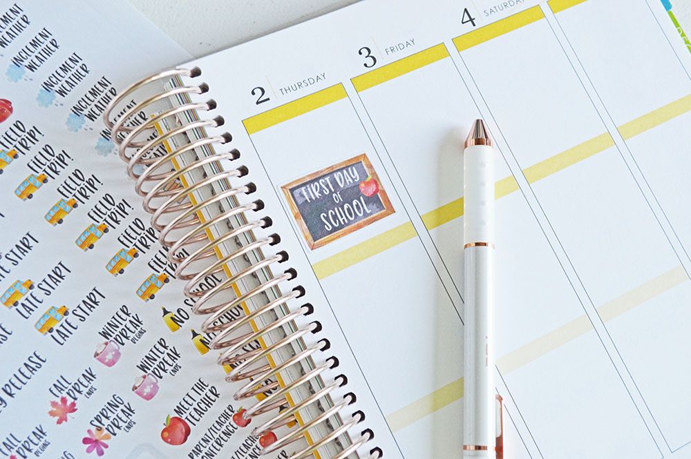
Also, don’t forget stickers for your Life Planner over in my Etsy shop!

Be sure to sign up for my email list for future planner updates and more content to help you organize your life!
You might also like these other planner reviews-
Powersheets Goal Planner Review
Erin Condren Daily Duo Planner Review
Erin Condren Planner Layout Comparison


